ShopDreamUp AI ArtDreamUp
Deviation Actions


![[ LIMONCHELLA ] Over a waterfall](https://images-wixmp-ed30a86b8c4ca887773594c2.wixmp.com/f/59f3e4a1-7ee7-48b0-b71f-74472be29613/dbfc674-90271b99-a8e7-4943-986c-fe3babda7de8.png/v1/crop/w_184,h_184,x_36,y_0,scl_0.042592592592593/__limonchella___over_a_waterfall_by_marchef_iustinianie_dbfc674-92s-2x.png?token=eyJ0eXAiOiJKV1QiLCJhbGciOiJIUzI1NiJ9.eyJzdWIiOiJ1cm46YXBwOjdlMGQxODg5ODIyNjQzNzNhNWYwZDQxNWVhMGQyNmUwIiwiaXNzIjoidXJuOmFwcDo3ZTBkMTg4OTgyMjY0MzczYTVmMGQ0MTVlYTBkMjZlMCIsIm9iaiI6W1t7ImhlaWdodCI6Ijw9OTAwIiwicGF0aCI6IlwvZlwvNTlmM2U0YTEtN2VlNy00OGIwLWI3MWYtNzQ0NzJiZTI5NjEzXC9kYmZjNjc0LTkwMjcxYjk5LWE4ZTctNDk0My05ODZjLWZlM2JhYmRhN2RlOC5wbmciLCJ3aWR0aCI6Ijw9MTYwMCJ9XV0sImF1ZCI6WyJ1cm46c2VydmljZTppbWFnZS5vcGVyYXRpb25zIl19.gsV_T_8Ot1xfj7eUhRt8Wx1aqOcTPp9jnuMopMoJzvU)
![[ LIMONCHELLA ] Over a waterfall](https://images-wixmp-ed30a86b8c4ca887773594c2.wixmp.com/f/59f3e4a1-7ee7-48b0-b71f-74472be29613/dbfc674-90271b99-a8e7-4943-986c-fe3babda7de8.png/v1/crop/w_92,h_92,x_18,y_0,scl_0.021296296296296/__limonchella___over_a_waterfall_by_marchef_iustinianie_dbfc674-92s.png?token=eyJ0eXAiOiJKV1QiLCJhbGciOiJIUzI1NiJ9.eyJzdWIiOiJ1cm46YXBwOjdlMGQxODg5ODIyNjQzNzNhNWYwZDQxNWVhMGQyNmUwIiwiaXNzIjoidXJuOmFwcDo3ZTBkMTg4OTgyMjY0MzczYTVmMGQ0MTVlYTBkMjZlMCIsIm9iaiI6W1t7ImhlaWdodCI6Ijw9OTAwIiwicGF0aCI6IlwvZlwvNTlmM2U0YTEtN2VlNy00OGIwLWI3MWYtNzQ0NzJiZTI5NjEzXC9kYmZjNjc0LTkwMjcxYjk5LWE4ZTctNDk0My05ODZjLWZlM2JhYmRhN2RlOC5wbmciLCJ3aWR0aCI6Ijw9MTYwMCJ9XV0sImF1ZCI6WyJ1cm46c2VydmljZTppbWFnZS5vcGVyYXRpb25zIl19.gsV_T_8Ot1xfj7eUhRt8Wx1aqOcTPp9jnuMopMoJzvU)


![Leopard Girl [Clothed]](https://images-wixmp-ed30a86b8c4ca887773594c2.wixmp.com/f/880ed40f-36dd-4403-9b62-8572d5a37e2d/db04cg7-2120bf17-8009-4e76-add0-ba580340ed2f.png/v1/crop/w_184,h_184,x_0,y_19,scl_0.1447678992919,q_70,strp/leopard_girl__clothed__by_blackkrahe_db04cg7-92s-2x.jpg?token=eyJ0eXAiOiJKV1QiLCJhbGciOiJIUzI1NiJ9.eyJzdWIiOiJ1cm46YXBwOjdlMGQxODg5ODIyNjQzNzNhNWYwZDQxNWVhMGQyNmUwIiwiaXNzIjoidXJuOmFwcDo3ZTBkMTg4OTgyMjY0MzczYTVmMGQ0MTVlYTBkMjZlMCIsIm9iaiI6W1t7ImhlaWdodCI6Ijw9MTEyOCIsInBhdGgiOiJcL2ZcLzg4MGVkNDBmLTM2ZGQtNDQwMy05YjYyLTg1NzJkNWEzN2UyZFwvZGIwNGNnNy0yMTIwYmYxNy04MDA5LTRlNzYtYWRkMC1iYTU4MDM0MGVkMmYucG5nIiwid2lkdGgiOiI8PTgwMCJ9XV0sImF1ZCI6WyJ1cm46c2VydmljZTppbWFnZS5vcGVyYXRpb25zIl19.3LYFw0wdZDm7AIsUZTDgRebOLupHcqohUiDuj_KjSFk)
![Leopard Girl [Clothed]](https://images-wixmp-ed30a86b8c4ca887773594c2.wixmp.com/f/880ed40f-36dd-4403-9b62-8572d5a37e2d/db04cg7-2120bf17-8009-4e76-add0-ba580340ed2f.png/v1/crop/w_92,h_92,x_0,y_9,scl_0.072383949645948,q_70,strp/leopard_girl__clothed__by_blackkrahe_db04cg7-92s.jpg?token=eyJ0eXAiOiJKV1QiLCJhbGciOiJIUzI1NiJ9.eyJzdWIiOiJ1cm46YXBwOjdlMGQxODg5ODIyNjQzNzNhNWYwZDQxNWVhMGQyNmUwIiwiaXNzIjoidXJuOmFwcDo3ZTBkMTg4OTgyMjY0MzczYTVmMGQ0MTVlYTBkMjZlMCIsIm9iaiI6W1t7ImhlaWdodCI6Ijw9MTEyOCIsInBhdGgiOiJcL2ZcLzg4MGVkNDBmLTM2ZGQtNDQwMy05YjYyLTg1NzJkNWEzN2UyZFwvZGIwNGNnNy0yMTIwYmYxNy04MDA5LTRlNzYtYWRkMC1iYTU4MDM0MGVkMmYucG5nIiwid2lkdGgiOiI8PTgwMCJ9XV0sImF1ZCI6WyJ1cm46c2VydmljZTppbWFnZS5vcGVyYXRpb25zIl19.3LYFw0wdZDm7AIsUZTDgRebOLupHcqohUiDuj_KjSFk)


Description
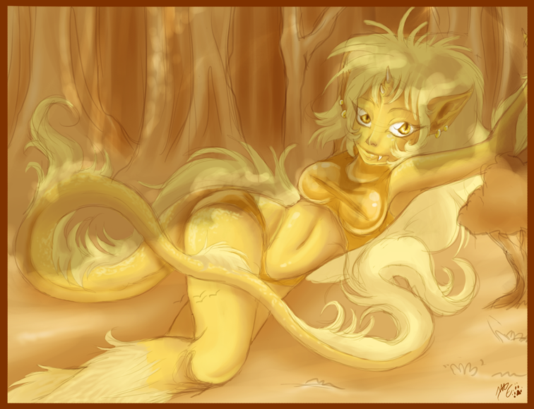
So, some time a million years ago, I was vaguely inspired to create a Dimensional Chimera character *three guesses as to why  (Wink)") * However, I had other things to do, and I plainly forgot about it and lost muse.
* However, I had other things to do, and I plainly forgot about it and lost muse.
I recently took a look at some of 's manga's, and I was more than vaguely inspired. And so, using the guise of the mythical kirin horse creature I have concocted a chimera character, one whom I'm still working on
  (Smile)")
Rate this sketchy sketch, but I completely SHAT thelinesketch-art, so keep that in mind ")
Felarya is (c)
PS: Her name is "Kirin". All the inspiration and imagination didn't go into naming her
I recently took a look at some of
's manga's, and I was more than vaguely inspired. And so, using the guise of the mythical kirin horse creature I have concocted a chimera character, one whom I'm still working on Rate this sketchy sketch, but I completely SHAT the
Felarya is (c)
PS: Her name is "Kirin". All the inspiration and imagination didn't go into naming her
Image size
756x580px 452.82 KB
© 2011 - 2024 ME-B
Comments16
Join the community to add your comment. Already a deviant? Log In
Alrighty then. Let us start from the top and work our way down, shall we?
For starters, the forest - simplistic as it is - I find does add a nice touch to the overall image. It helps to establish the scene and it would be missing something without it. I'm a little curious though about her size/scale - is that a bonsai tree/odd bush next to her on the right, or is she large enough that the tree is supposed to be small in relation?
Onwards, I find that the elements of her face look a little large for it - in particular the eyes and mouth. I don't know if that was the intent or if it should just be a style point, but they could use with more perspective and proportioning, I should think.
The detail work of the face is good though, the nose isn't so rigidly defined this time around which greatly helps out I think; additionally the horns and earrings add to the exotic affect/appeal of the character.
We lose a little bit of detail with the neck and upper body though. For example, one of the limitations I've noted with your style is collarbone rendering - especially with regards to a pose like this one. The viewer should definitely be seeing more of it given the position of her arms.
Moving on to her arms, I'm not sure what is going on with the right one. The visible hair/fur we see, I can't tell whether it is a part of her hair-mane or if it is a tuft on the arm, but in either case the line of the shoulder doesn't match with the arm later revealed.
Additionally, I think there was a little missed opportunity here for detail - it might just be the pose as you saw it, but I would think it'd have been a nice detail to show her hand pressing back against that mane of hair from against the tree she's laying against.
I see that for this image you decided to incorporate vice renew on the chest - which comes off at least decently well, even if it isn't necessarily helping you to improve an area you are admittedly weak in. Regardless, the detail of the left breast I'd say is still remiss (as in looks too much like it is 'floating') despite the tightness of her shirt. Also, another style point - detail was missed with regards to the lower band of the shirt.
Given how tight it is, I'd expect to see a fold or two pushing up/biting into the bottom of the breasts and accenting them further. The stretch mark across the nipple-line helps with defining, but more could have been done without detracting.
Moving on to her waist/hips, I'd have to agree with others that the design of the clothing isn't going to be of good use. We can clearly see that the upper cloth band goes beneath the tail, and given where it rests on her body anyway you're going to have both the tail and hips pushing down on it making her need to adjust often.
You stated that this is a bit outdated, but if you wished to keep the design all I'd say that is needed is for the design to go across the top of the tail - sort of like a split band, and instead of relying solely on tightness to stay up have them tied off. This would also make them easier to get on/off, as she wouldn't have to work her tail through a hole or anything; just pull 'em up and tie the top off.
I don't have any significant comments in relation to the tail. The scale effect was a nice touch on her thighs and tail, helping to remind the viewer of her more exotic nature.
The legs though - first, right there on the lower thigh: you have those little 'seagull' marks and at first I thought they were more scale representations, but then I noticed there was another on the ground beside her... so I'm not sure what they're supposed to be, if the one on the ground is supposed to be there.
Second, the shading/rendering of the portion below the right leg knee is a bit botched. Her knee suffers as a result, making the joint look odd at best.
The ground beneath her as it approaches from the left side of the image also has some irregularity to it. It looks a little too 'shiny' especially compared to the ground as rendered to the right of her body. Honestly, it looks like the ground 'curves' on the left side, like an impromptu speed bump or something that just sort of disappears into her.
That's all for the critique, now for random first impressions: my first thought when seeing this image was "Goldmember"; she's not of that descent, right? No? That's a relief.